Showing posts with label collage. Show all posts

Saturday, June 18, 2011

An Absolutely Shameless Plug!

Since my last post I'm afraid I fell immediately into the firm grip of the local dreaded lurgy (commonly referred to these days as flu!). At last I have regained some temporary control of my throat and lungs again and have reduced my coughing to some sort of nightime annoying tickle and am able to at least function in some sort of semi coherent way approaching normal again, YAHOO! But enough about my health issues and onto the arty news!

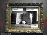
I'm sure many of you know that the fabulously hardworking Alicia Caudle over at the Altered Bits site has released her first edition of the Altered Bits zine as a print issue! Oh hooray! While I love downloads for their space saving and green tree preservation soft and fuzzies, I am the first to admit there is nothing more mystical for me than the slow drooling over a real page turning experience. It's probably the reason I love book arts so much. Can't resist the touch of the page or an intimate session with something textural either for that matter. While art is forever a feast for the eyes, the more senses I can engage at any one time in an artistic experience, the better I like it! Having said that smello-vision might have me rethinking about some experiences, but I digress!


I have two submissions in this edition of the zine. Below is my piece in the Notorious section entitled
'Never Dull'.
The piece is a 8" x 10"mixed media collage mounted on a wrapped canvas featuring the rather infamous Bonnie and Clyde.


The second submission was for the theme -Letters and Symbols, and is also a mixed media collage although this piece is mounted on a
9 1/2" x 11 1/2"book cover.

Titled 'In Praise of Writing' the piece is a reflection of the Chinese peoples contributions to human society with the invention of both paper and writing. The central symbol is a fragment from a silk and paper scroll and is the character for 'water' or 'river' and is symbolic of the ink used to produce writing.


(Both pieces are available for sale. Feel free to email me for details or leave a comment here and I will get back to you.)

While that covers my own submissions I would strongly recommend that you consider purchasing this zine in either the downloadable or hard copy print edition. Neither will break the bank or your hip pocket to purchase and in return a fabulous feast of arty offerings will be yours to pour over for eternity.


Including 21 artists who offer an array of styles and pieces and 46 drool worthy pages, there is bound to be something that sparks off your own creative senses.


So what are you waiting for.
Click the picture above now and it will whisk you off to the dear Alicia's page where you can order your own drool worthy edition!

As for myself I will be back in the very near future with some Pulp updates for you.
Stay tuned!

Thursday, January 20, 2011

Texture Peeks

I know it's a bit quiet over here at Wandering Heart Studios but there is lots happening.
Of course you know I can't tell you about it yet so...

until then enjoy some texture from the studio.


Perhaps some white...


and some not quite white!


(and no this isn't a picture of my skin!!!)


Texture from sneaky peeks...


and the imprint of a leaf in hand made paper.


Hope your day's a textural one!
Posted by Picasa

Saturday, June 5, 2010

Postcards from the Heart

Have I left you all in suspense for long enough?


It's probably time to put you all out of your misery and let you all in what has been going on in the studio for the last few months!


As many of you know I have been buried deep in the Pulp Redux collaboration and am really enjoying it too, but what I haven't let out before is that I am also involved in another collaboration with the gorgeous Caterina from La Dolce Vita.


When Caterina and myself decided to embark on a collaboration together I had all the usual ideas but somehow it wasn't working for me. I just wasn't satisfied with how things were shaping up in an already existing book structure so decided to make my own.


Introducing...


Postcards from the Heart.


The book is constructed entirely from fabrics, many hand dyed along with the embellishments.


The story is set in the late 1800's and finds our heroine about to undertake a tour of the continent, something reasonably common amongst the well to do families of the time. The story is told through a series of fabric constructed postcards sent by our heroine back to her friend in England. The pictures on the postcards are actual photographs of various european cities taken during the late 1800's and transferred onto the fabric. The reverse or postcard side of the cards is also achieved using transfers and are also photographs of actual period postcard documents. Each postcard sits inside a pocket on the page and is an interactive element.


The pages themselves reflect the nature of the postcards they contain, contributing to the overall theme and feel for the story.


Of course the story remains unfinished until Caterina adds her own piece to the whole so you will only be able to view the goings on so far as I have done them. There are a number of pieces of prose throughout the book contributing to our knowledge of our heroine for whom you never find out a name. She signs everything only with an 'A'.


To bring you to a starting place I will give you this piece which is included in the first page of the book. The words by James Kavanaugh provided me with a wonderful starting point for the story.


Some people do not have to search - they find their niche early in life and rest there, seemingly contented and resigned. They do not seem to ask much of life, sometimes they do not seem to take it seriously. At times I envy them, but usually I do not understand them - seldom do they understand me. I am one of the searchers. There are, I believe, millions of us. We are not unhappy, but neither are we really content. We continue to explore life, hoping to uncover its ultimate secret. We continue to explore ourselves, hoping to understand. We like to walk along the beach - we are drawn by the ocean, taken by its power, its unceasing motion, its mystery and unspeakable beauty. We like forests and mountains, deserts and hidden rivers, and the lonely cities as well. Our sadness is as much a part of our lives as is our laughter. To share our sadness with the one we love is perhaps as great a joy as we can know - unless it is to share our laughter. We searchers are ambitious only for life itself, for everything beautiful it can provide. Most of all we want to love and be loved. We want to live in a relationship that will not impede our wandering, nor prevent our search, nor lock us in prison walls. We do not want to prove ourselves to another or compete for love. We are wanderers, dreamers and lovers, lonely souls who dare ask of life everything good and beautiful. - - James Kavanaugh


So would you like to take a peek at the book now?


Enjoy the slideshow!

(You can click to bring it up full screen size)


I can't wait to see what Caterina does with the storyline, or what happens to our girl. The photographs used in the book are all curtesy of the Commons project and available to the public under a commons licence through Flickr. Many thanks to all those institutions for their continued support of a wonderful resource.

Thursday, October 1, 2009

Golden Sunshine

I thought I would give you all another sneaky peek into a creative process. Okay so last post we looked at a little journal creativity, now onto something a little more challenging. I thought I would post the process of creating a mixed media piece. Nothing too elaborate, collage and acrylic painting. Sounds easy...well truthfully it is. So lets begin.

Now I have a primed canvas board ready to go. Next I add a little paper for the background with some mat medium.


I'm impatient so I dry it with my heat gun. What can I say, I don't want to waste time so the heat gun is one of my fav essentials.
Next it's time to add a bit of paint. Now I want the background to be quite pale, hints of colour showing through but no real colour domination, so lots of white shades with hints of colour.


Now you can see the collage papers have receded to the background and have really become more background texture. Its hard to see here but hints of the original colours show through the painted surface. So now its time to sketch out a few ideas. I use a pencil to lay out a rough sketch then collage some papers over the surface. These lovely papers were part of a gift from the lovely Ro Bruhn. She has the most gorgeous papers available for sale.Fabulous colour and patterning. I would highly recommend them. The papers have formed the main structure of the figures dress and the building set into the background, and I have used an offcut from some text for the bottom of the bird cage. Now over the surface its time to lay on a little paint, beginning to build the main framework for the piece.


Oh dear no legs! Its a part of the process I will add them in later.
Little by little it starts to come together. Gradually I am building layers of colour, filling in the details.


See legs!
Now you can see the detail building. The dress sleeves, castle, tree and cage, the flowers. They are all strarting to pull together. It doesn't matter if it isn't perfect, just go back and refine it later. At the worst you can always start again. What's a little paint between friends! Time to cook dinner I'll be back later.

Posted by Picasa

Okay back again. So now lets just keep filling in detail. Time to paint the features of the face. Now to add some fine detail using ink. I use a pen to draw in the detail of the dress, bird cage, castle and flowers. I add detail using acrylic paint to the flowers to create colour depth and highlight areas. The light is the trick. It has to look right. I'm not perfectly happy here but everythings a learning curve, right?
This photo had some sort of weird lighting moment its not quite as yellow as it appears here.


Now we are almost there. Add some flowers to the tree and the figures hair. These are tissue paper and then over painted to highlight them. Add the butterflies and bird, then the words and...

tada!


Well not a masterpiece but you get the idea. Now this is very not my usual style but I was having a little fun trying out something different and decided this would do to show you the process. Hope it helps.
We will get back to your regular viewing channel next post, promise!
Mixed media-collage : tissue, assorted paper scraps, mat medium, acrylics, ink
Posted by Picasa

Sunday, September 27, 2009

Wandering, wandering... for 45,000 years

Time to share a journal post for September with you all, before the month completely runs out and I get too far behind. Life has been hectic of recent times with illness and work committments but now the committments are done and I am free to art away again, Yay!
Pat over at The Weaver of Grass, asked me a little while ago to share my collage process with you all, and I said I would once the crazy work stuff was over.

So today's the day. I thought we would start with one in a journal. Journals are a great way to thrash out ideas, techniques and allow you to makes mistakes and learn without pressure. You don't have to share them with anyone and they are just the greatest learning tool EVER!!!. So what if it all goes horribly wrong? It was cheap, you lose nothing but time and a little of this and that, you learned something, and you can just turn the page and start again! Yay to the freedom. And no one ever has to see it if that's how you feel, woohoo obligation free experimentation!


So here's the start of Septembers page.


At this stage the page has a coat of Gesso and some tissue paper stuck to it. I used mat medium but feel free to use whatever you like, remember to experiment that's a major part of what you are doing here. I wanted a tissue background and I have zillions of tissue patterns left over from when the kiddies were little tikes. How jolly convenient!


Next its time to splash around a little paint and develop the background. Now I did have some preconcieved ideas here. Objectives to achieve. I wanted bright colours. The page was going to be a reflection of Australian colour and light. It's bright here, bright light and colours so thats what I add to the page. A little stamping is added to the background for interest.


A smudge here and there, fingers are great tools, LOL!


Now lots more paint. What colours do you imagine Australia to be?
Reds, golds, and earthy tones inland. Lots of greens and blue shades along the coast.
I wanted to represent the inland areas in this page , so bright golds and reds, a little green and

voila!


Some scratching here and there, building up the layers and visual interest.

Now for a bit of focus. What do you want to say?

I want the page to speak to you about my home in terms of its texture and colours.

I add a gel medium transfer onto some calico, I like the rawness of it.
Its an iconic Australian image. The kangaroos and the setting outback sun.

I add some stamped numerals and some wording to boost the imagery. I want the message to get across, and I have something to say.


And there it is...


I am wandering, wandering...

45,000 years of history incorporated into the page. (well at least visually I hope!)
Australia is an ancient land. The aboriginal peoples ancestors migrated here approximately 45,000 years ago.
European settlement only a tiny 231 years ago, give or take a few days, LOL!

Journal page -gesso, tissue paper, acrylics, ink, calico, gel medium transfer, paper, bark and text.
Posted by Picasa

Sunday, August 23, 2009

Crashing Back into Reality


Well unfortunately the holiday is over and I find myself crashing back into the world of reality and the demands of full time work. I must devote more time to working out how to earn an income from holiday life. Wouldn't that be wonderful. Unfortunately since I don't, it's back to the grindstone for me! This does not mean that there has been no time for art. On the contrary, I have been completing a couple of projects, which I can't show you yet, and so that means again journal play only to show, well at least for a wee while.
So here we are, the first page in a new journal...
step inside.
Seems an appropriate starting place.


Some play with water colours and acrylics.


And it's on to a collage, I've been headlong into a bit of a poetry plunge and this piece has stuck in my head.


I sometimes feel this happens to me. I spend so long immersed in the research, techniques or the colours of someone else that my own creativity seems to get bogged down in it all and it fills my head. I am in need of some clear space I think to refresh myself. So there will be no more research for a time just art play to enable me to breathe. I feel better already!
Posted by Picasa

Sunday, February 22, 2009

Darwins Adopted!

Well sometimes I just crack myself up! Not sure others will get my weird sense of humour though. I have admired Marsha Jorgensen's art for some time now and admit to stalking her blog over at Tumble Fish Studios. I love the colour and techniques in her work (and can only wish I had half the talent occupying her little finger!) and so I decided to borrow her style (and I say that very loosely Marsha) and have a play. Here he is, poor Darwin! I read this funny quote from Steven Wright about his theory of Darwin being adopted (tongue in cheek I guess as he is a very funny comedian) and couldn't help myself, so here he is, captured at the moment he finds out. Of course Larry the fish just had to tell him, he can't let the poor fellow go through life not knowing can he! Acrylics, watercolours, collage elements, papers, stamping with Stazon and journalling .
I have been having a little journal playing. Yes, yes I know you got that! It was time for my February page for the Blue Bazaar journal challenge and here it is. This month saw the prompt in the form of a variety of images to choose from. I only used the triangular shapes and the words 'art journal' from the prompts. Funny but this page was just screaming to get out and ran onto the page as fast as I could get it down. Love it when that happens! Maybe because its just simple, no mucking around being the perfectionist this time as I am want to do then become very disappointed later! More of this I say! Yes, I like this fast flowing work!
Pretty simple as I said . Acrylic background some paper collage elements, more paint washing and splattering then a fiddle with the journalling pen and voila! If only all of life could be so simple and such fun!
On another note the secret project is growing, so well in fact it's much bigger then my original intention, as sometimes these things are want to do, it has taken on a life of it's own. I am happy with the progress however, maybe I'll put in a few sneaky peeks soon. Don't want to blow the suprise for the recipient!

Monday, January 19, 2009

Journal Journey's

Well I have decide that this year will be dedicated to learning, both in a professional and artistic sense. On a professional level I will finish my Diploma of Early Childhood this year, yahoo, but also artistically I have decided to spend time learning all I can and so have signed up for the journal challenge over on the Blue Bazaar website. There are many of us and already I am amazed at the pages that have been done. Prompts in style and techniques will be offered each month and it is just wonderful to see how each person has interpreted these ideas and the amazing page each person has created. This months prompts were to create an abstact background and to draw something. Shock, horror, my heart is pounding! Did I hear draw!!! The mere mention of the word draw in relation to some artistic thing I would be involved in turns my insides to water! Me, who draws the world's most challenged stick figures! Well I did say it would be a learning curve. Time to tighten the belt and get brave, or at least down a quick drink of one's favourite poison and pretend! And so to battle!

Here is my January page. The background is a watercolour paper, covered in gesso, texture paste and acylics. I then used tissue papers, gel medium and stamping to create the weed look. The fish is my drawing (well there's a suprise!), also on watercolour paper. Painted in acrylics then embossed and adhered to the background with gel medium. The doors are a collage item adhered with gel medium as well. The word bubbles are created separately on watercolour paper, coloured, text applied then coated in dimensional magic then adhered to the background. Lots of fun and I did enjoy the process more than I thought I would after I finally sorted my head around the whole drawing thingy. Of course the original ideas I had were quite different, but as is often the case with art, it develops a life of its own and becomes something quite different from the original idea. So there, the first one done and not too bad I think, well at least I can live happily with it and thats what counts! This however is not the only journal challenge I have set myself this year. I have also set myself to doing some collage journal work as a personal challenge and so have embarked on another separate journal to explore collage work in. That's right I am running two completely different journals at the same time. I do love a challenge! The one over on Blue Bazaar is more about techniques etc while the second collage journal is a bit more personal. Here's a peek...
and the next...

Well there you have it, the start of an interesting time, well for me anyway. The collage process was loads of fun and quite theraputic really. I really enjoyed this process from beginning to end and am keen to do more. Let me know what you think I would love to hear your comments.
On another note entirely this is not all for the year. No, the year will not only be about journal journeys, this alone would not sustain my interest and too much is already floating about in this head of mine to stop there. The secret project is coming along well and I am enjoying that journey as well, but... more of that at a later date.

Sunday, January 4, 2009

Atc's overseas

I can now share with you all some atc's I made a few weeks ago as they have arrived at their destination in The Netherlands yeterday. For those not familiar with atc's they are artist trading cards, little works of art using any media that appeals to the artist. Their only formal requirement is that they be strictly 2.5" x 3.5" in size and they are for trade only and never for sale. It is quite challenging to produce a piece of artwork so small. Many artists are restrictive about the number of decorative additions to such small works so as not to overcrowd them and create a chaotic feel to their artwork, however in saying that I have seen some amazing art created in such a small format. I recently entered into a swap with Sanderijn (obviously in The Netherlands) with a christmas theme, well it was that time of the year! She is such a creative soul and I have admired her work for some time now so was quite excited about it. I made two atc's, one for the swap and one as an RAK (random act of kindness) just for fun to send to her. Here they are...

Here is the first, "A Christmas Angel". The background is made from tissue paper and gloss medium then has a little strip of music and the word noel added. The angel is a freebie image (sorry can't remember from where now) and mounted over a jewellry finding with a small brad. The wings are constructed from card and feathers the also held in by the brad on the finding. I then attached the skirt and cord with glue. The wings spread out, but in this picture they are folded down for storage and travel. Below is a picture with the wings opened out.

And here she is in all her glory! I like her this way better but the moveablility (is this a word???) of her wings was necessary so she could be stored more easily without damage. Anyway her recipient liked her so that's all that matters really! Below is the second atc sent, also using a freebie image (curtesy of Renee Robinson fabulous collage artist, visit her on Flickr).

I just couldn't resist this little guy, after all that effort to find out no Santa! He was just too cute! Anyway I'm glad you liked the atc's Sanderijn, anytime you want to swap I'm there! I will post a pic of her atc when it arrives.

Below is a couple of other atc's I made some time ago. I just loved these silly old paper advertisements from the 50's and 60's. They are such a hoot and just screaming for someone to send them up! Can you believe they were serious when they created these! Here's the first one. I am planning to make a series of them but haven't as yet completed them (I will keep you updated as this happens), called Dick and Jane. Do you remember those old first reader books from your childhood? Well Dick and Jane were the first official school readers I can remember so it seemed appropriate to name these two after them. They sure look like Dick and Jane's to me!. The first atc in the series used two different advertising images. Jane was from an ad for hosiery I think while Dick came from an old bathroom advert. First a background of tissue and gloss medium, then a gel transfer using a pattern similar to many bathroom tilings of the period, then after it dried the images applied again using gel medium. The atc is edged with a frayed ribbon creating the fringe effect.

Of course I envisioned the two of them doing something else entirely different to their original creators! The second atc uses images from an old shaving soap ad. Bit racy for the 50's era! However here's the second installment of Dick and Jane...

This one is constructed in the same fashion but instead of the gel transfer an overpainting with gold mica paints was used in the background. I felt the images were too large for much else in the background, the couch just gets in the way, bit like what Dick is probably thinking really! Well that's it for today. I'll be back with further updates in the series at a later date.