Life seems to be all about the little things of late.
Details, it's all about the details.
Take heart...
there's one for you.

I seem to be stuck in this mode...
making hearts.

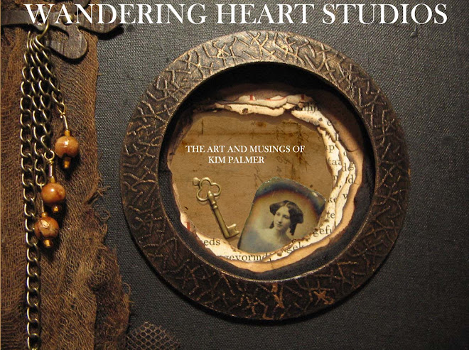
I have changed my blog header, mostly as I have decided to spend some time putting on a more professional appearance.
At least that's the idea anyway.
You will have to tell me what you think. Is it working?
Hopefully soon, a store front where you will be able to buy my art as well.
In the meantime...
remain young at heart.


15 comments:
oh dearie! first the header is wonderful! your work and your vibe just fabulous! and then the hearts, yes we must have hearts in our life. stitching those hearts for my last show really helped me heal my broken heart. I know it will do lots of good! love your young at heart.. the stitches are exquisite xoxox I heart you back..
As a fellow heart lover- I'll never get tired of hearts. We all have them and hopefully, they are kind, and generous and giving- which would mean they are in their true form. And so are the beautiful hearts that you make- the materials and layers and subtle colors are all delicate and so inviting to want to take a closer look and feel!I see hearts in everything! Your banner is great- professional and expressive- everything you can ask for!!
Loving the new header Kim!
The hearts too, just love that they are handmade and not mass produced. They're lovely:)
Love, love, love the header. I think it is quite brilliant!
The header is gorgeous and I LOVE "young at heart: it's just gorgeous!
Looks like you might be getting ready for some sewing in Lisa J's book, Kim? The hearts look so tiny and so cute! Your header, of course, is wonderfully Pulpy! Love it and yes, it does look very professional, although your other one was just as gorgeous and professional looking too, you know!
Love, love the new header. It is so romantically elegant, perfect for the wandering heart. I'm looking forward to your store. (Am thinking about taking the plunge myself.)
Your wee hearts are just precious. Am holding one to my heart.
Hi Kim
A big yes to your new header - very artistic! Sweet little hearts too - you've been busy!
LOVE the new header! it's gorgeous. i miss that book already though, i must admit. shipped it off to lisa yesterday.
i used to hate hearts for some reason but as of late have ben very, very drawn to them too. how odd is that? i've been seeing a lot more lately -- seems we are not the only ones.
lots of love to you, my friend!
Your new header is beautiful!!! Very imaginative, and wonderfully mysterious. Also I love your hearts and your slide show! Roxanne
Wonderful header Kim. Hearts are sweet too.
Dear Kim,
I too find myself lately focusing on hearts, so I enjoy following along. Your new masthead image is very professional.
I understand about the need to customize ones Blogger appearance, as it is one I have done several times until I felt I found the right mix between image, type and general flow of the elements on the page.
I would recommend not using center justified for the type as it makes thinks more difficult to read. This would include regular full justification since you are not in control of the spacing and therefore end up with too many gaps between the letters.
Finally, I voice the general opinion of graphic designers that a black background is something we all avoid. There are other options for a dark background that would end up being a nice balance between the images and text. Contact me if you are interested in an alternative.
Wishing you all the best,
Egmont
the first thing I noticed was your new header so it sure grabbed my attention! Looks great. I too loved a black background but kept reading that white was more serious. Go with your instincts. In my opinion the world needs more hearts!
getting to the beautiful heart of the matter dear Kim!
so lovely each and every one!
you header is gorgeous and draws me in!
oxo
Your hearts are gorgeous. Your new header is wonderful. Everything is perfect in your site. Have a wonderful day.
Outsourcing call centers
Post a Comment